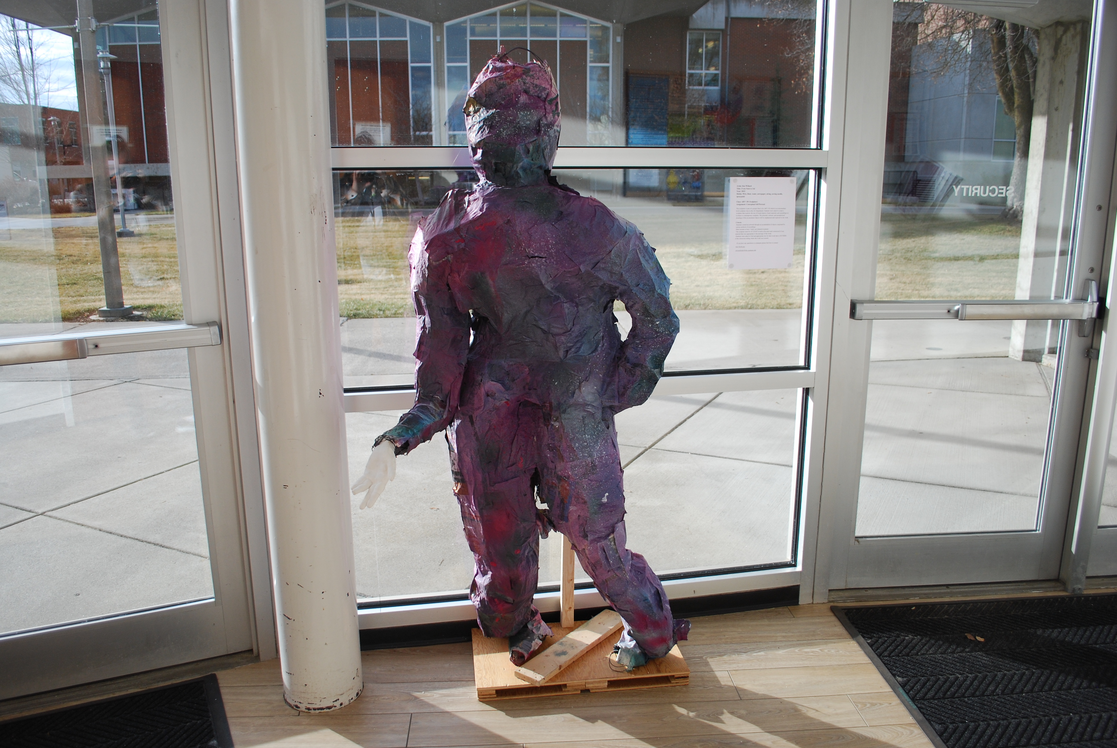
Rob McKirdie is the the Art 130 instructor on campus, his class created sculptures all quarter long as a project. These sculptures, like the ones pictured here, were placed all over campus for students to enjoy. These eye catching creations are inspired by our students and created to jump out at you. A paper placed next to each sculpture can tell you the name of the piece and who made the art. If you are interested in getting your creativity on, sign up for Art 130.
Behind the Art – Sculptures Explained by their Creator
Seth Collier – “Void of Meaning” – Located in the music building
“My title is a play on words designed to help illustrate the paradoxes of my experience living with Schizoaffective Disorder. The nature of my condition often causes me to interpret my experiences with wild and irrational conclusions, leaving me to read deeply into the significance of things that, in truth, have no significance at all. When my condition is at its most extreme, the world around me becomes a dangerous infinite abyss of personal meaning that I could fall into, which I have represented in my sculpture with an infinity mirror.
The catch 22 for me is that the remedy to my irrationality is not comforting at all. For my own sanity I must remind myself that the world is void of meaning, which is a thought that most people would prefer not to dwell on. Nietzsche says that if you “look long into the abyss, the abyss gazes also into you,” because reflection on a meaningless universe must conclude that life itself is meaningless.
My sculpture is decorated with mirrored stones, Rorschach blots, and both traditional and asemic writing, all of which serve to remind the viewer that what appears to have meaning does not, and is at best a reflection of yourself.
Climbing the stairs of my sculpture to look into the infinity mirror creates a confrontation with the abyss, begging the question, ‘will you choose to live in spite of it, like I do?'”
Olivia Reit – cardboard spray-painted house – Located between the music building and the technical arts building
“Originally the project called for a conceptual self portrait. I have taken this class before, so my professor said I could do something else, and I chose to make a statement.
The structure I built is a commentary on Homelessness in Spokane, entitled “Look away,” or “Don’t look.” I had several ideas about politics around homelessness in Spokane, but some of the biggest points are this: We take what we have for granted, and we can do better.
So, when tackling the topic of Homelessness, why did I build a ‘house’? It starts with Maslow’s Hierarchy of needs. Anyone who has taken a basic psychology class has learned about this, the pyramid-shaped measurement for the needs of human beings. At the bottom is “Food, Water, and Shelter.” I am sick of hearing people say “get a job,” or that people who are homeless are just lazy. When people are not able to meet their basic needs, when we are trying to get the basics of survival down, how can we be expected to thrive? I build a shelter space to draw attention to exactly that; that real human beings are in our city and don’t have a place to get warm or to sleep safely.
If I could convey anything to the general population, it would be the reminder that all of us are human, and that before we are straight or gay or tall or short or any of the markers that we use to identify individuals, we are PEOPLE. I have personally begun to change my language, and to encourage others to do the same, from “homeless people” to “people who are homeless,” and return them to being people first. There’s a lot of psychology around how our words that we choose to use change how we see things, and it might not feel like a huge deal to call people “homeless people,” but I hope to change the language.
My hope is that as a community, we can stop digging this us-and-them divide that permeates every topic that polarizes people. We can bring awareness to people who are homeless, and work together to find real solutions.
The other major component of my project was the spray-paint. I chose very intentionally to only paint the inside, and I chose the rainbow colors on purpose too. It pairs conceptually with the title, and the concept is this: when we see people on the street corners holding their signs and we choose to look away, we’re sorting them into categories, pretending they are invisible, and we will entirely miss the beautiful soul inside the human beings every single time. There is so much more inside—we feel that about ourselves and out loved ones. I think people are oblivious to how much we dismiss when we “Look Away.”
We can do better.”
